
tl;dr
scope
1 week
Solo project
contributions
Heuristic evaluation
Responsive mockups
Keynote presentation
problem
Being an e-commerce website, The Burning Rose Co. needed a more seamless checkout process.
solution
I worked primarily on product pages by organizing the layout of the menu, adding a quantity drop down and adjusting image sizes for a clean, professional look.
the burning rose co.
The Burning Rose Co.’s goal is to create a seamless checkout experience that simplifies and clarifies the process for customers to purchase merchandise. To achieve this, we must ensure the purchasing process includes all necessary elements.
research phase
heuristic evaluation
I made notes of things that I noticed was missing and needed, and also things that may make the product page feel more organized so information is easy to find.

heuristic evaluation
• user feedback •
feedback 1
“The layout effectively supports user navigation, particularly when selecting products. However, the transition to a dark background during the checkout process seems incongruent with the site's overall aesthetic, which is characterized by light, sweet, and pastel tones. This abrupt shift may disrupt the user experience, and a consistent, lighter background would likely enhance visual coherence. On a positive note, I appreciate the side menu, which allows me to view all the available items easily.”
feedback 2
“I think the actual purchasing process flow is easy, and it's nice that the prices are listed. I'd say having the information on the side makes the design part look odd. I would suggest moving the menu to the top of the page, and having a text logo in the top corner, rather than what's on the left side of the screen currently. That would make it cleaner and easier on the eye. Also to note, if your colleague wants to keep the logo as-is, they should use a transparent background, which would help the logo look clean and modern.”
design phase
early sketching
Some of our rough sketches before building lo-fi prototypes.
hi-fi prototype
With the app mapped out, all that was left was to build the high-fidelity wireframes. We applied the brand colors, and logo into our design.

brand colors
logos


Applying the style guide above to our design, the hi-fi prototype was now complete.

original product page

original cart page
final product page

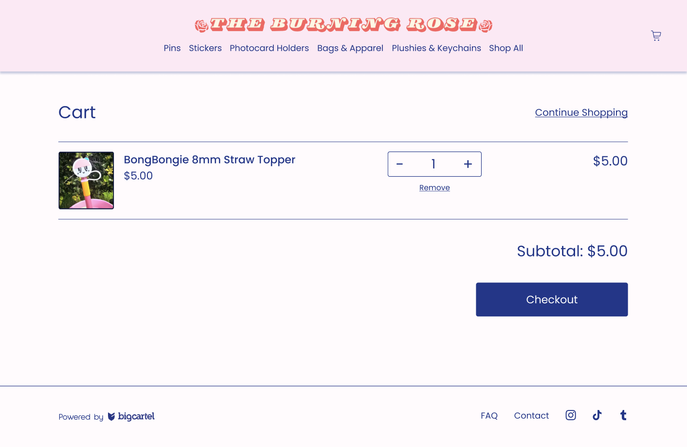
final cart page
final design
After evaluating and feedback, I ensured the final prototype included the following features and updates:
Navigation Bar
Switched from side bar to top
Updated Logo for more visibility
Added hover effects that reflect the logo design
Added selected tab effect that indicates which tab the user is currently on
Changed “products” to “shop all” which will serve the same function (takes you to all products)Cart on top right
Added a footer for remaining navigation that was overcrowding top nav
History TrailAdded breadcrumb trail to easy maneuver between pages
Image display
Changed non-selected images to be on left side vs bottom to decrease scroll
Checkout
Added quantity drop down
Changed add to cart button to showcase status
Added view in cart button that appears once an item is added to cart
Added hover effects on buttons