A fully built, responsive microsite for Kohl’s newest athleisure line, FLX.
FLX by Kohls
tl;dr
contributions
Screener/interviews
Persona development
Information architecture
Feature development
Responsive mockups
Keynote presentation
problem
Users struggle to shop activewear online due to the absence of touch and confusing or minimal sizing options. How might we help users find comfortable, sustainable options for activewear by providing inclusive sizing and a comprehensive view of color, texture, fit, and movement?
solution
A responsive microsite including a size guide that can be a destination for old and new kohl’s customers. Our team made design decisions with Kohl’s goal of further launching into a leading destination for active and casual lifestyle in mind.
scope
4 weeks
Team of 6


FLX is a brand launched by Kohl’s specifically for athleisure. The motive behind FLX is to be “flexible” meaning this is size inclusive and versatility in type of athleisure.
research
the user
The survey included questions that were demographic, related to the online shopping experience and likes/dislikes towards Kohl’s itself. Some of our key findings are shown below.
96%
shop through mobile device
mostly shop at Amazon or Target
72%
typically shop online weekly
53%
With this information in mind, we were able to identify who might the user be.

user persona

As user researchers, we want to understand our users’ struggles, behaviors, and motivations while shopping online.
We have identified the user, but to fully understand the users needs, we used our survey and interview data to draw out an empathy map.

Gains-
“I shop online because it’s convenient”
Rewards
Online Variety
Price Comparisons
Pains-
“I want to try my clothes on before buying.”
Shipping Costs
Return Hassles
Wrong size
Additional feedback about Kohl’s website is that it is (1) easy to navigate, (2) users enjoy the search bar, (3) visually appealing website, (4) users appreciate the automatic coupons, (5) easy to shop by department, (6) easy filtering, and (7) they don’t have to click a lot.
So, if the users are enjoying the Kohl’s website as it is, how can we improve it further with Kohl’s goals and the FLX label in mind?
the brand
We began by making note of Kohl’s goals with FLX. The achievements they are working towards are:
Strengthen Kohl’s position as a destination for active and casual apparel.
More aggressively serve as the most trusted retailer of choice in those categories.
Taking the information learned about the users and the brand goals, we prepared a SWOT analysis to factor in what competitors are/aren’t doing to dive deeper and provide Kohl’s effective feedback on possible solutions.
strengths

Price match available / omnichannel, partnership with Amazon, Aldi, Sephora, etc.

weaknesses
Poorly rated for shipping and technical support, only available in US.
opportunities

Mobile App, partnerships with more name brands like Lands’ End

threats
Amazon moving into brick and mortar channel
FLX sells fashionable, sustainable, high-quality athleisure that fits every body. A value proposition map helps clarify what new features may or may not be valuable to the company while simultaneously being favorable to the users.
solution
A question our team asked ourselves was,
“How can we design an efficient yet stress-relieving experience around choosing size options?"
We built a responsive microsite that can be a destination for old and new Kohl’s customers. Our team made design decisions with Kohl’s goal of further launching into a leading destination for active and casual lifestyle in mind.
You might be thinking, why a microsite?
It is important for retail stores to upkeep their online website. With an uproar of online shopping beyond just clothes, people are wanting to shop online. Sometimes, a poorly organized website can lose traction. Kohl’s is a well established brand and they have had their online website running for quite some time now.
“Traditional retailers are feeling the heat. Even as competition intensifies, shoppers’ visits to retail stores are declining every year...”
- Harvard Business Review, January 2017
That being said, they have so much to offer, all in one place. While that may sound nice, it becomes a little overwhelming with all the other brands they carry for the same item they’re selling themselves through FLX. We found it best to showcase what FLX has to offer compared to its competitors that Kohl’s also carries by giving it its own microsite - which is also linked in the original Kohl’s website for exposure and to keep things together in a more organized manner.
design phase
prototypes
mobile lo-fi prototype
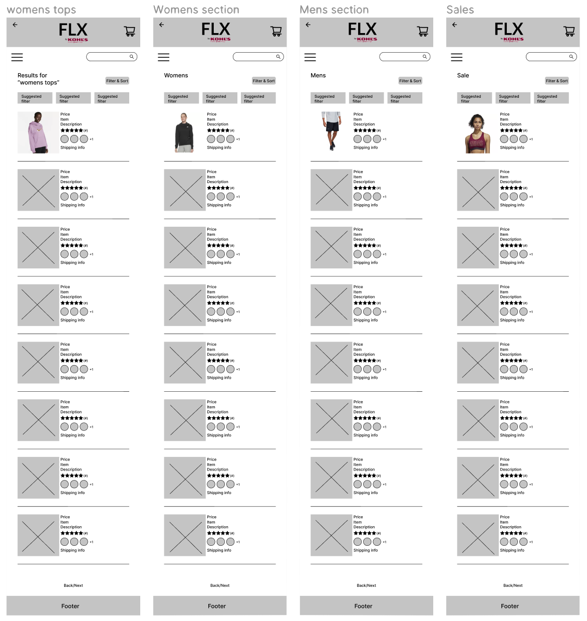
After sorting the information and categories needed for the FLX website, the organization of the microsite was mapped out. We were able to build lo-fi wireframes to begin designing how the site might look and how the information it will provide is presented.


a/b testing
Understanding the user needs and business goals in mind, we designed a microsite for Kohl’s on FLX. We had the option of keeping the original Kohl’s branding color scheme, or create something new that fell in line to the tone Kohl’s wanted to give.
We sent out an A/B test to see which design most people preferred. With 138 responses, over 50% preferred the red palette.

version a

iconic kohl’s branding
action, power, energy, passion, desire, strength, motivation, and confidence

version b

sustainable life and organic material
wisdom, confidence, intelligence, faith, tranquility and calmness
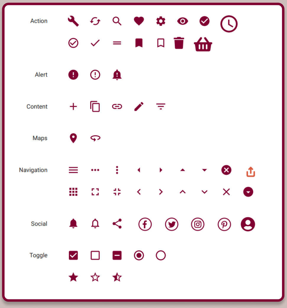
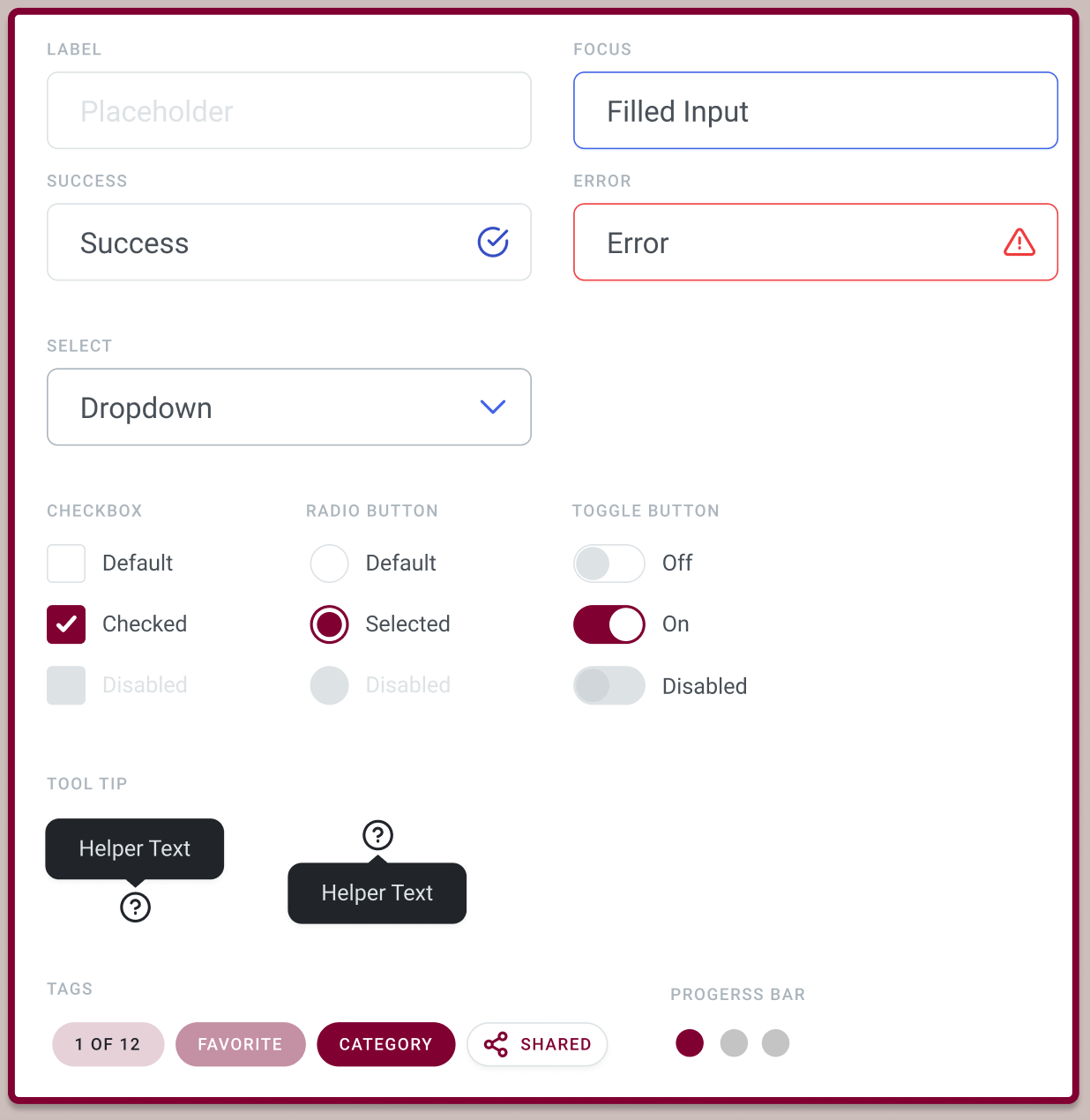
The responsive design goals we had for the microsite needed to make its customers feel that FLX has consistency, is useful, efficient, memorable and intuitive. We also wanted the front-end design to give an accessible, approachable, functional, organized and truthful appeal. With Kohl’s, FLX and user feedback in mind, we created a style guide that will later be implemented in our prototypes.
style guide

color palette

buttons
icons


forms
beyond the final design
Moving forward, I would like to implement the positive feedback we received regarding the Kohl’s website onto the FLX microsite (i.e. having coupons readily available).
Since building this microsite, Kohl’s has completed their FLX line and updated the color scheme. They did not continue with their staple Kohl’s maroon, rather, they updated to a soft pale blue. As a UX designer, I’d like to research how this conclusion was drawn and also to update my design to match the current FLX branding design.
