Website redesign assisting mint based tobacco-less chewing company to appeal to their target audience.
GRIT Herbal Chew
tl;dr
contribution
User research
Persona development
Screener/interviews
Feature development
Responsive mockups
Keynote presentation
problem
GRIT was designed to attract the tech-savvy businessman who’s looking for a high quality tobacco free alternative. How might we improve the GRIT website so that it appeals to their target customers and our stakeholders feel successful in communicating their brand identity?
solution
We redesigned GRIT’s desktop and mobile website in efforts to rebrand and reach their target audience. We also proposed potential features for higher engagement.
scope
3 weeks
Team of 5


GRIT is a startup company that focuses on the modern user seeking to quit chewing. their purpose is to provide a cleaner dip that gives the same effects of regular smokeless tobacco.
research phase
gender
identify as male
71%
age
are in their twenties
72%
interest
prefer to chewing tobacco
74%
Now that we established who is the user and their interest in dip, we then proposed questions probing how they view chewing tobacco.
frequency
are chewing 2+ times daily
55%
desire to quit
attempted to quit before
67%
demand
are interested in a tobacco-alternative product
37%
Without any experience in dip, we found it difficult to relate to the user GRIT had in mind. In order to fully understand the user, we had to seek out a community of dip users - both currently using or trying to quit. I proposed we conduct a survey including questions regarding demographics, what they like about chewing and if they consider[ed] quitting. Our survey yielded 54 responses which, in turn, had people curious about the product.
user feedback
We began the questionnaire with questions regarding demographics. This helped us understand who is typically using tobacco[less] products. Our findings were surprising to us as we assumed most tobacco users would use cigarettes over dip but cigarettes only made up 16% of the responses.
When it comes to using tobacco products, the biggest concern is health issues and oral care according to our data.
GRIT uses mint as a replacement of tobacco to replace the cool burn it provides. This not only is healthy, but is great for oral care.
We wanted to make note of this to highlight it on their website.
empathy map
We built out an affinity diagram based on our feedback that helped us form an empathy map and develop a persona.
storyboard
Using the empathy map, we composed a storyboard to help visualize the process.
heuristic evaluation
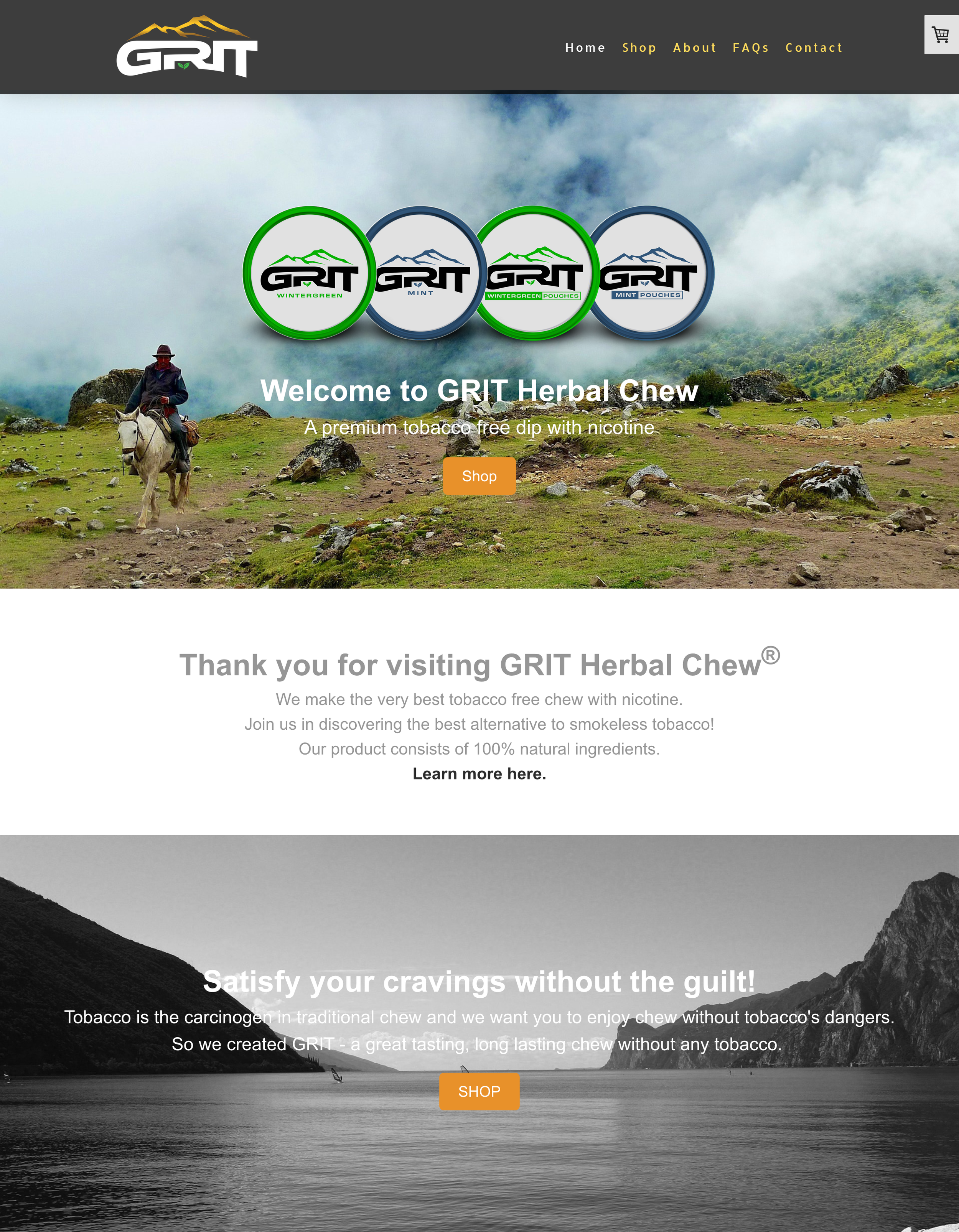
After analyzing GRIT’s website, we made note of some items that may create issues in a design perspective. The following are some of our findings:
Cart is not in line with other navigation items
Text on image gets lost/imagery under text is more prominent than the text
Too much grey/washed out
Images may not be relevant to content
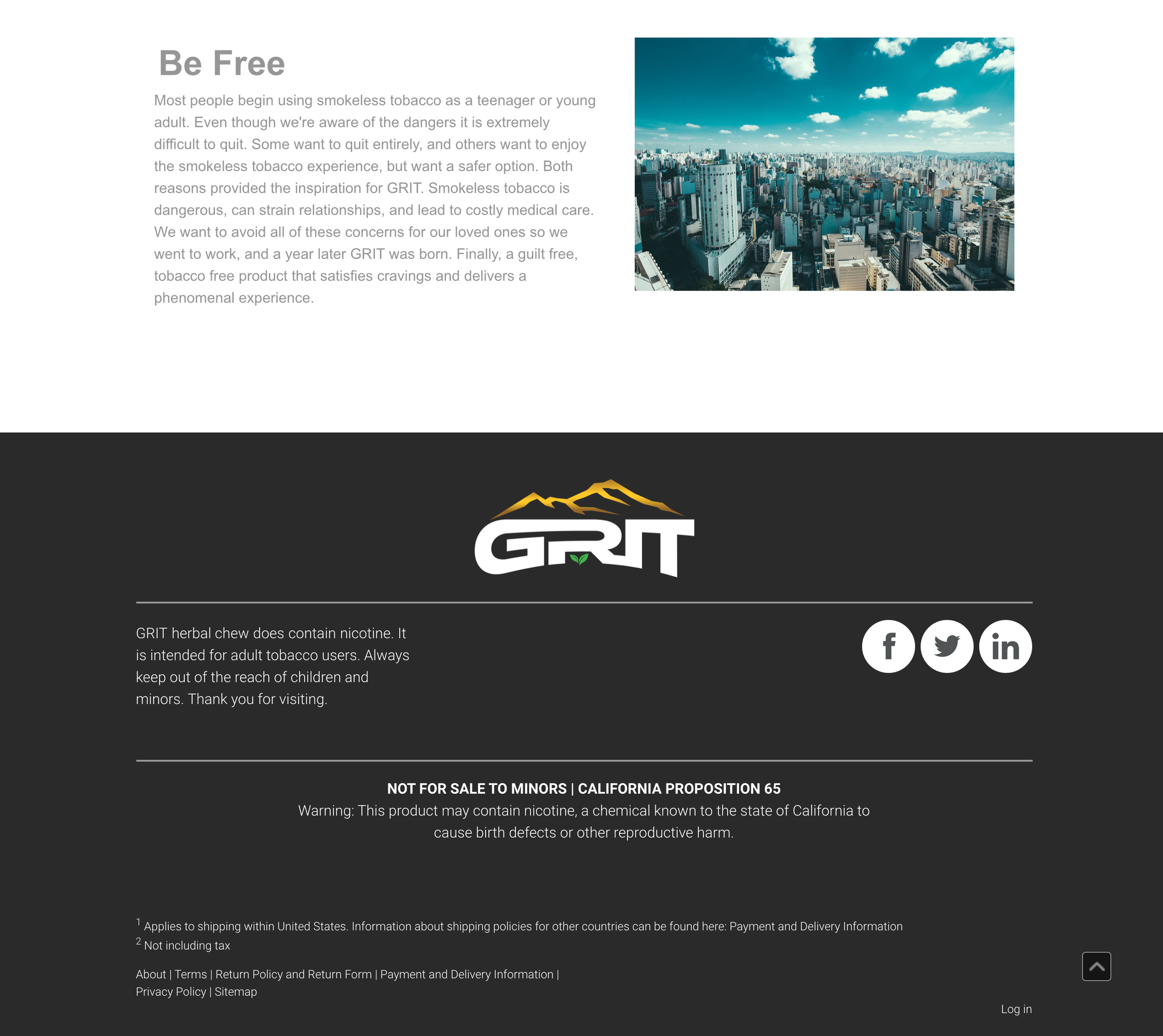
Social media links were not up to date


design phase
site map

Conducting a site map builds out the entire skeleton of a website from the header to the footer including what content will be present in each page.
It helps us stay true to the website in an organized fashion.
We managed to keep all information concise and categorized it in its respective grouping.
Now that we had a visual of how the website would be mapped out, we were able to build prototypes and design a style guide.
style guide

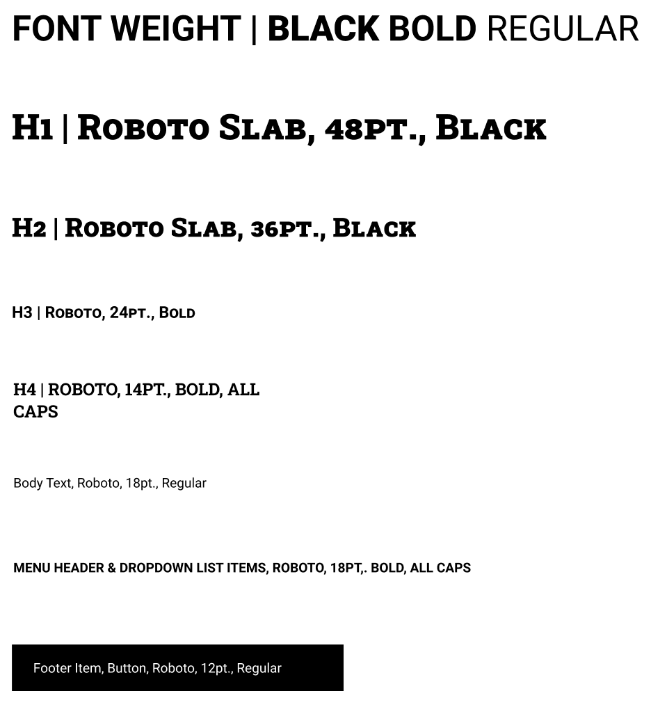
typography

buttons

tabs

color palette
design evolution
desktop
We began designing with simplicity in mind. We knew we wanted the logo, a cart, and tabs for the pages. Including a “sign in” icon for our proposed feature would help GRIT build relationships with their recurring customers. Adding colors from the style guide and showcasing how a tab would look based on the page someone is currently on are essentials.
header


mobile
With the same elements as the desktop, we attempted to pull each icon and tab into a clean design. The icons for the tabs were too bulky so we removed it completely. Doing so helped us achieve a consistent design with the desktop version. Additionally, we decided to separate the “cart” and “sign in” icons in order to balance the overall look.


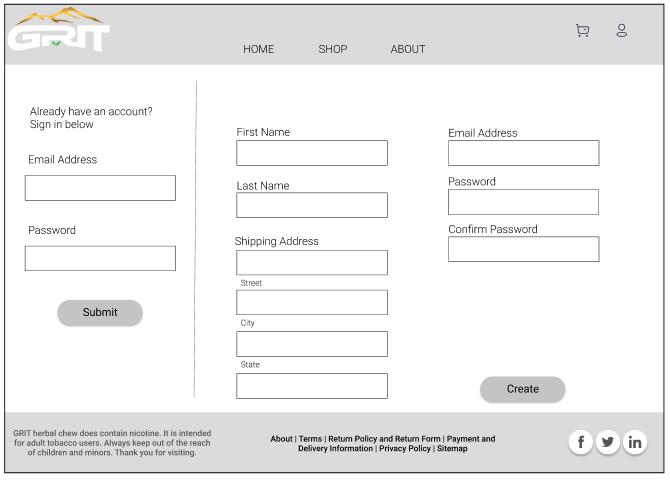
lo-fi prototype
desktop
mobile
video walks through lo-fi mobile prototype
Includes a small section highlighting an intro which leads to the “about” page.
A user journey slide was added in thought of being motivational or helps user feel seen.
Nicotine warning was added.
Added footer with essential links and social media

hi-fi desktop
walk through the new, modern, tech-appreciative version of GRITs website.
view full interactive prototype here.
hi-fi mobile
high functioning mobile version of the new GRIT website.


beyond the final design
To better understand the user, I would have liked to do additional research on the process of getting off of a tobacco addiction. With this information, we could have asked more thorough questions to delve even deeper in their thought process.
We had ideas to propose and design a rewards program or equivalent that helps people with their quitting process. We thought this was a double win considering it is helpful to the users but would help the company with recurring customers.
Because quitting is not a one-and-done process, we thought another way to engage with customers, that would repeatedly turn to GRIT, is to have social media. We proposed to help build out GRIT’s social media and include tips, motivation, and promotions.
GRIT is a startup; we did not have access to the sales, but we wanted to suggest the idea to include product reviews to help boost the interest in the items.


